Oldagram Solo Project

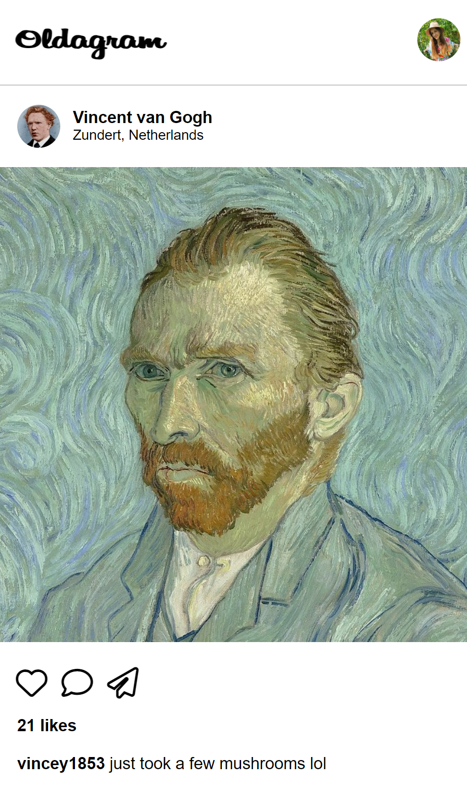
Welcome to the funny Oldagram solo project.
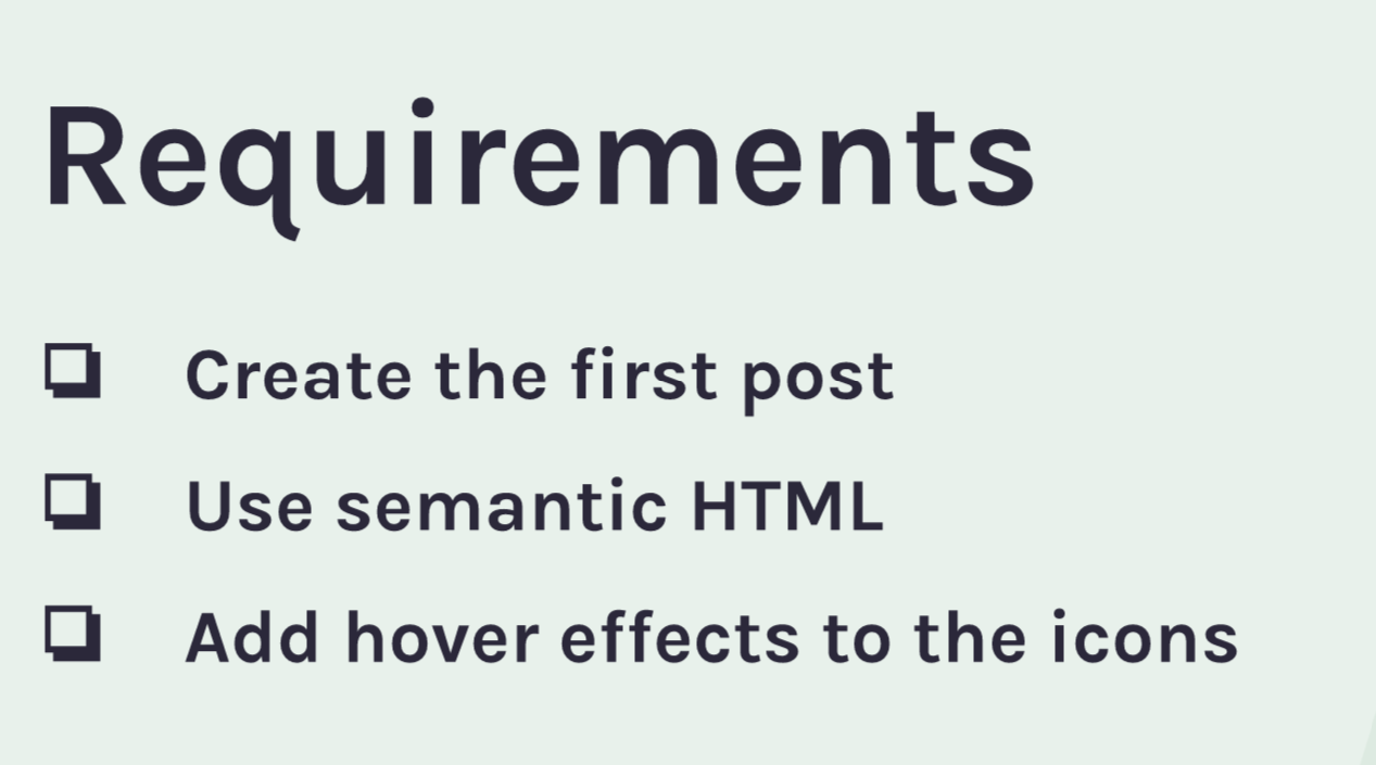
The requirements of the project were:

Although it was HTML and CSS practice, I managed to implement some JS features, too (I am just in love with Java Script). I also did some stretch goals.
What I have done
I decided to render all data, that was given in an array. To accomplish that I used JS. I mapped through the data array and created a post with an HTML layout with the data from the array. After that, I added the layout to the
Although all three posts appeared on the page, I encountered a bug - the unexpected commas were displayed on a screen. But no worries, StackOverflow came to my rescue this time. Here is the answer:
".map() returns an array. You probably want to return a string containing the array elements concatenated together. You can do that with .join('')"
As for semantic HTML, I used the following tags in my layout:
- header with a nav in it
- main
- article
- section
Dealing with icons wasn't the easiest thing, but I read through font-awesome documentation and managed to color them on hover. For them to be visible when not hovering, I needed to use
-webkit-text-stroke-width: 0;
-webkit-text-stroke-color: transparent;
It made their outline visible.
Now for the more difficult part...
Going above and beyond
I couldn't bear it when my icons do nothing. I decided to make my heart icon increase likes. It wasn't easy to accomplish, because they kept increasing the likes of each post when clicking only one.
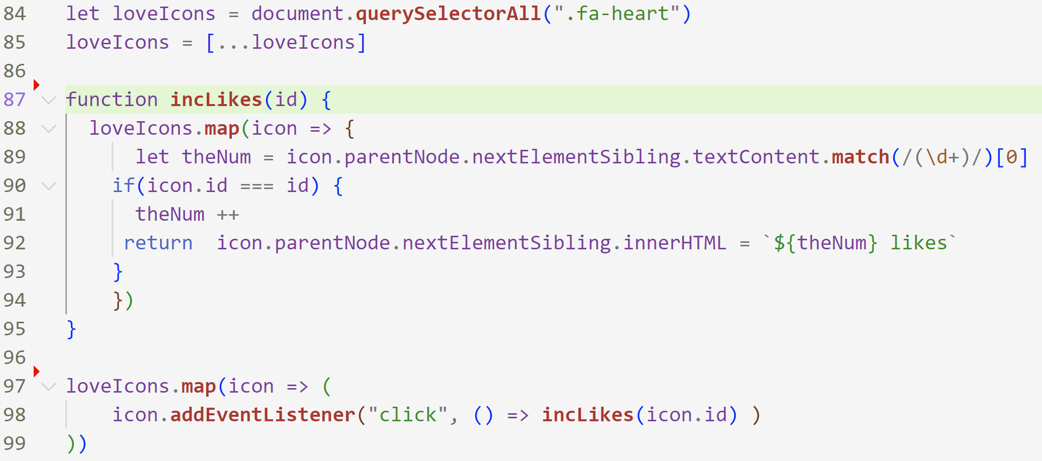
Finally, I came up with the following code:

Firstly, I converted an HTMLCollection of loveIcons variable to a simple array to be able to map through it.
Secondly, I created a callback function with the id parameter, so we can check what icon was clicked and target only that icon in the icons array later. In the function, I also extracted a number of likes from a string and increased it in the condition of matching ids. After that, I renewed innerHTML of icon.parentNode.nextElementSibling ( that's how I reached to the specific paragraph of each post) and populated it with a new number.
Finally, I mapped through the icons again and added an event listener to each icon with our callback function, passing the id of the icon (for that I used an arrow function to be able to pass the argument to the callback function).
Important takeaways
- Margins (when the element touches its parent element, its top margin will merge with the parent's bottom margin). Solution: add the padding to the parent element.
- It's quite common not to use ID for styling.
- Links are for navigation; buttons are for interactions
- block elements (we can set height and margins top and bottom)
- inline elements (sit side by side; we can't set height and margins top and bottom; ex: span, a)
- inline-block elements (sit side by side; we can set height and margins top and bottom; ex: button and input)
- We can make a span display:block for styling purposes
- We can set multiple containers on different sections
- inverse - a popular naming convention for switching backgrounds from light to dark.
- In CSS small touches make big improvements, so don't forget to work with your font's margins.