Mobile first solo

Welcome to the "Learning journal" solo project!
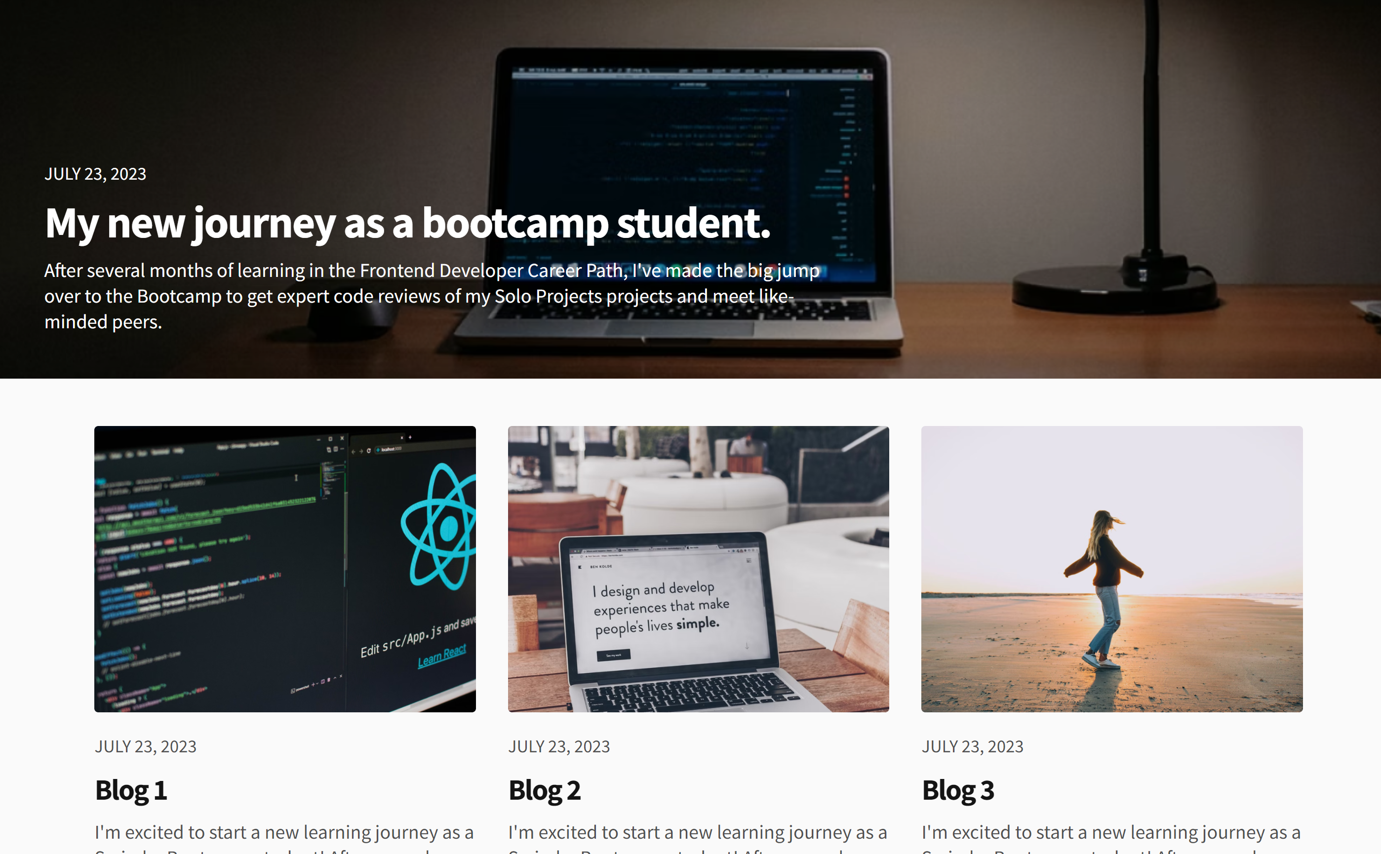
This was a Solo project in Scrimba's front-end developer course. Solo means I created it from scratch, looking only at a Figma design. The theoretical part of the module, that preceded the project was about Responsive design and Mobile first approach principle, so you'll see a lot of CSS, media queries, and a little JS in my project. But as I love JS, I couldn't help myself but try and play with things.
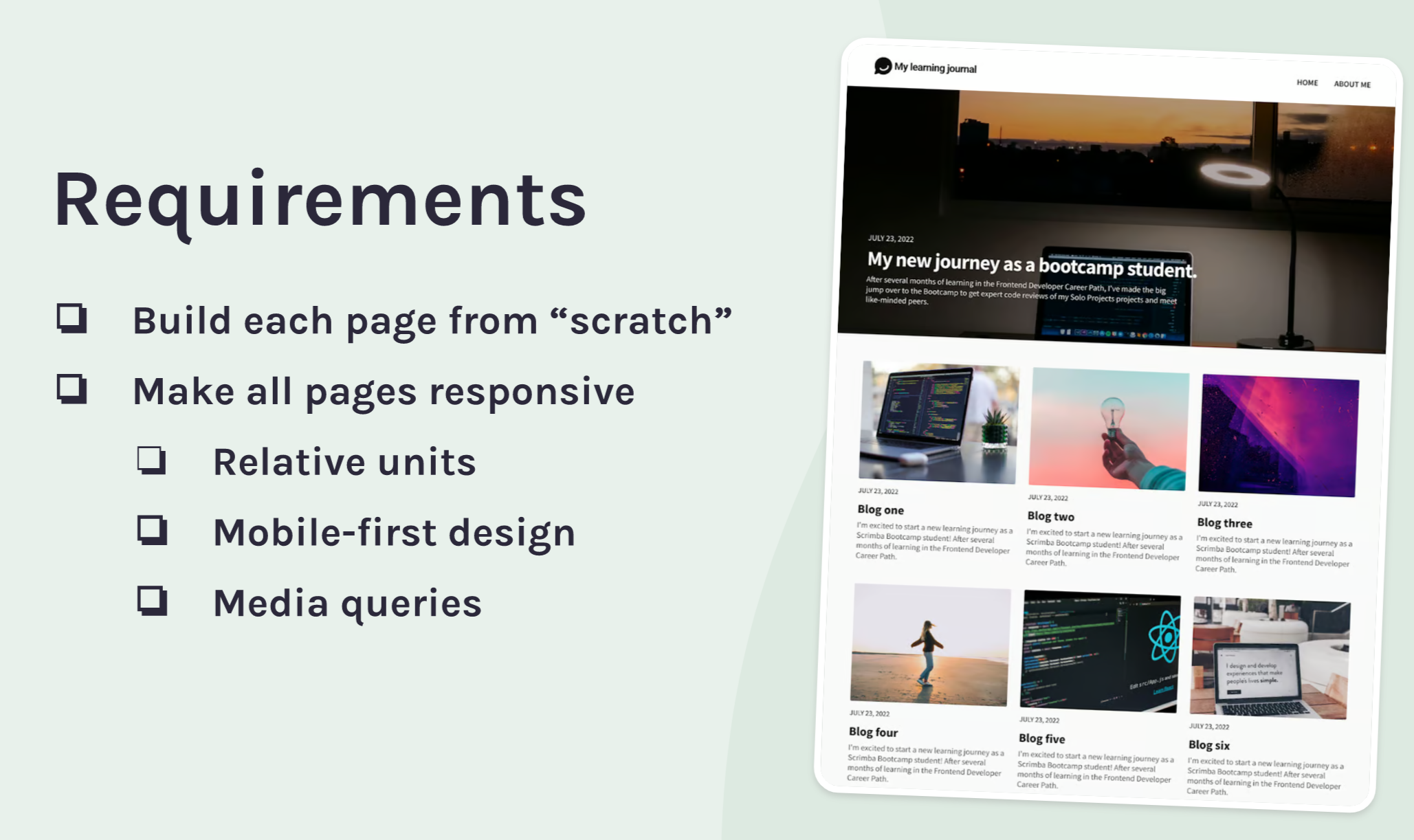
The requirements of the project were:

How did I build it?
Firstly, I created a project structure, that consists of 3 HTML files, 3 corresponding CSS files, 1 separate CSS file, that contains the shared classes and properties (styles.css), and 3 corresponding JS files. I built an HTML template, with elements, which are similar on every page (navigation, grid, footer, blogs section) and styled them, using a mobile-first approach and measuring gaps and sizes in Figma. Then I created media queries for larger screens and styled the common elements in them (typography and a grid layout). After that, I created unique elements for every page and separate CSS style sheets for every page, for a more convenient and readable code. I styled those unique elements and also the elements, that are not unique but have a different size on a larger screen.
Finally, I brought some movement to the project with some JS. As there were stretch goals, I'll tell you all about them in the next section (yeah this is separation of concerns in action) ;)
Stretch goals
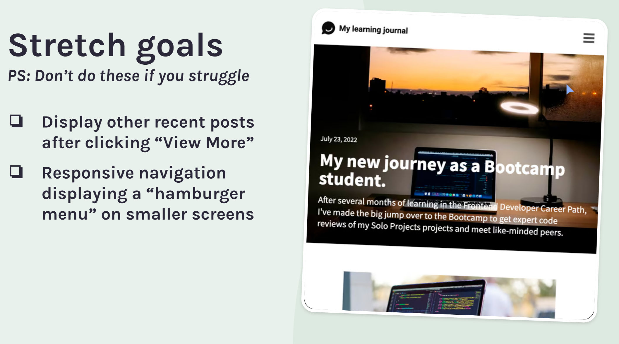
Scrimbas' suggested stretch goals:

What I did:
- I made the navigation responsive.
It may seem easy, but there are some hidden catches in it. One important thing that I found out is that for better accessibility:
Don’t hide the
The
How is that possible?
We should place the toggle button inside that’s wrap them. Then, the button element will be placed somewhere, for instance, at the top right corner of the screen.
If you want to know more follow this link: https://www.a11ymatters.com/pattern/mobile-nav/
- I gave functionality for the "View more/ less" link.
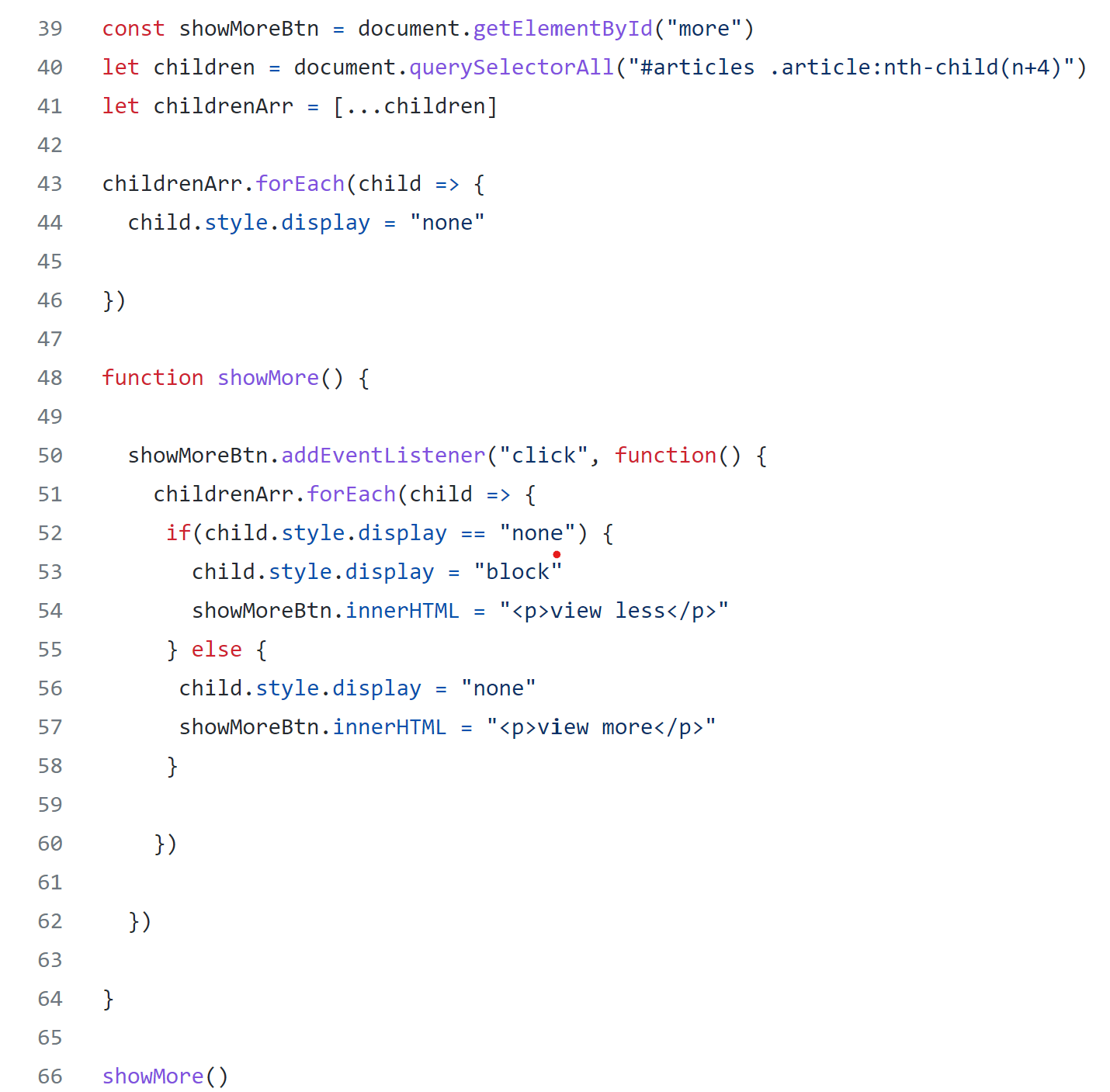
I accomplished that by grabbing all images after the 3rd one using nth-child in a querySelectoAll. I set them to none in global scope but made them visible in the showMore function on a link "click" event. In the code below I'm toggling the appearance of the images by checking the state (none or block) of the image style display.

- I made the clicked image appear on a new page.
I know that you can easily do it with React routing, and I'm eager to learn React. But for now, I decided to make it with pure JS. In my code, I found the clicked image using the data attribute and added (unshifted) its src to Local storage as an array item. On a page, where I wanted it to appear, I grabbed the src of the first image in an array (it is also the last image that we clicked) and set the image src on the page to the src from Local storage.
What were some of the design decisions?
I improved the design of the pages a little bit by adding a hover effect to the navigation items and to the posts.
What did I learn aside from the module curriculum:
I learned how to:
- build responsive navigation
- use text-shadow property
- target elements in CSS using nth-child
- find elements using nth-child in JS, using query selector
Besides that, I found a great website to learn and practice grid, flexbox, and different CSS properties in a fun way. I already have a grip on it with its help. It's a developing project and new games are constantly appearing. There are now some JS methods games. Aren't we lucky to have developers in this world, who are making the whole studying process a fun game? :)
If you're interested in it, follow the link: